
Shifting link between arthritis and obesity demands more reporting

If the big variation in arthritis across the country isn’t driven just by people getting older, then what explains it?
Local factors are always at play. The predominance of certain types of occupations and occupational conditions. Lifestyle options. Access to care and the quality of care.
The factor that I think merits deeper inquiry, though, is obesity.
For most of the last two decades, obesity rates have been rising in nearly every county in the U.S., even in some of the healthiest counties. And the differences in obesity rates are considerable, from 18 percent of all women in Falls Church, Virginia, to 59 percent in Issaquena, Mississippi.
All that weight puts a huge strain on your joints and makes you more likely to develop arthritis. It also alters the body chemistry in ways that appear to have a role in arthritis, too. This means that obesity is now a known risk factor both for osteoarthritis (caused by too much pressure on the joints) and for rheumatoid arthritis (caused when the body’s immune system attacks the joints). (Note that the CDC study that was the inspiration for these posts was based on a survey question that included various forms of arthritis: “Have you ever been told by a doctor or other health professional that you have some form of arthritis, rheumatoid arthritis, gout, lupus, or fibromyalgia?”)
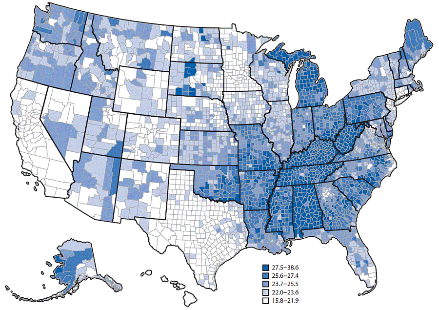
I’ll explore the science behind links between obesity and arthritis in later posts. But I can already tell you that it’s not a one-to-one ratio. Communities are complex, and bodies are even more complex. So we can’t say that just because one part of the country has more people who are obese means they will also have a proportionally higher rate of people who have arthritis. You can see this in maps of places with high rates of obesity and places with high rates of arthritis. There are places where the connection looks clear and places where it seems anything but.
Look at the swath of dark blue running through counties from West Virginia and Kentucky to Oklahoma and Louisiana on the arthritis map made by the CDC for a recent study, and then look at the swath of dark red and orange running through the same states on this obesity map (made by my employer, the Institute for Health Metrics and Evaluation). There are big divergences, too. One of the biggest is in Texas, where so many counties have high rates of obesity but apparently lower rates of arthritis.
The challenge for a reporter would be to actually link these two datasets and talk with experts about the places that appear to have a strong link and the places where the link is weak.
I intended to do that very thing for this post, but I was stymied when I went to download the data from the CDC’s website. There’s a map showing all the counties, right? The data must be a few easy clicks away.
Not so.
I wrote the corresponding author on the CDC study, Dr. Kamil Barbour. He responded by pointing me to the original survey dataset that was the basis for the study, data from the Behavioral Risk Factors and Surveillance Survey, the largest telephone survey in the world. But that’s not what the CDC is showing in the map it made. As Barbour explained to me:
To produce the map we used a complex modeling strategy involving multi-level analyses and post-stratification weighting followed by age-adjustment. You can read more about the details in the MMWR [Morbidity and Mortality Weekly Report].
I already had read more, which is why I wanted the numbers that were being show in the map, not the responses from the surveys, which, by the way, would be nearly impossible for most reporters to extract and make sense of given the size and complexity of the database. So I asked Barbour again:
What I was trying to find were the arthritis estimates that you showed in your study. The Behavioral Risk Factors and Surveillance Survey data will just give me the survey responses, not the actual estimates you used in the MMWR and that you used to make your map. Can someone send me a CSV file that has each county and their prevalence number, the same number you used to make the map in the report?
I received a two-sentence response from Barbour:
This is not possible. Thank you for your inquiry.
Except that is possible. As I have written before, people think they can shut reporters down by saying, “Move along. There are no data for you to see here.” But if there’s a map, there are data. If there is a graph, there are data. If there is a table with numbers in it, there are data.
I’m now asking others at the CDC for the same data. I would encourage you to do the same. Let’s find out whether obesity is the big driver behind the varying rates of arthritis across the country.