What’s the true toll of the epidemic? Here’s how we estimated it for Florida.

(Photo by Dan Mullan/Getty Images)
In recent weeks, The Washington Post, The New York Times and FiveThirtyEight have reported that the true toll of the coronavirus epidemic is much higher than official death count.
Curious what’s happening in your state? So were we.
I write for The Tampa Bay Times. Here in Florida, the death count has been controversial and closely watched. The state Department of Health maintains the official tally. But the state’s medical examiners, who must certify all COVID-19 deaths under Florida law, have their own count. In April, a colleague and I reported that the two counts were different, with the official tally missing some cases. Then the state stopped releasing the medical examiners’ data.
We knew the discrepancy explained only part of the undercount. Experts were telling us that a number of COVID-19 deaths had almost certainly been misclassified in March and April. They also believed some deaths from other causes happened because people were scared to seek care.
Reporting in The Washington Post, based on a Yale-led analysis of federal data, suggested the undercount in Florida was small. Still, we were curious what the data could tell us about the epidemic in our state.
Two of my colleagues started by requesting monthly mortality data from Florida’s Bureau of Vital Statistics. Around the same time, I connected with a health researcher at the University of South Florida who was looking at the weekly death counts published by the U.S. Centers for Disease Control and Prevention. I asked if he would be open to a collaboration. He was.
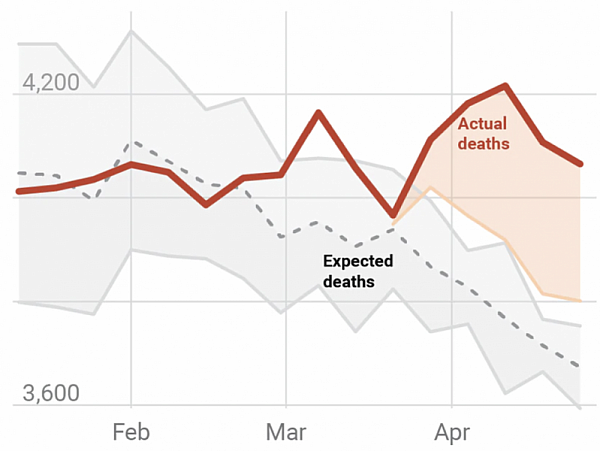
Our goal was to compare the total number of deaths in Florida to what we would expect in a normal year based on the last few years of data. Public health experts call this an excess death analysis. We looked at deaths from all causes, not just COVID-19, because we knew that some epidemic-related deaths had been attributed to other things.
We used the federal data instead of the state data, partly because the former included a field for COVID-19 deaths. We did, however, look at both datasets to make sure there were no inconsistencies.
Troy Quast, the USF researcher, used two different methods to calculate the number of expected deaths for each week of the year. First, he took the total number of deaths for each week dating back six years and adjusted for population growth using U.S. Census figures. Then, he calculated the average.
He also used a more conservative measure preferred by the CDC that involved calculating a 95% confidence interval, or a range of values that had a 95% probability of containing the true value. We used the highest number in the range as our more conservative estimate for the expected number of deaths. (The approach is similar to the one used in this JAMA article that estimated excess deaths in Puerto Rico after Hurricane Maria in 2017. I wouldn’t have been comfortable doing this calculation on my own, so I was glad to have an expert spearheading the work.)
We took our estimates of expected deaths and subtracted out the actual number of deaths for that week. We presented “excess deaths” as a range between the two figures. Then, we subtracted the number of COVID deaths to show how many could not be explained by the official death count.
By some measures, we found hundreds more deaths in Florida than the official count. It wasn’t the thousands that researchers and journalists identified in coronavirus hotspots like New York. But given the smaller size of the epidemic in Florida, it felt meaningful.
The analysis got more interesting when we dug deeper. We repeated the exercise for two subsets of the data: deaths by natural causes (i.e. infection and disease) and non-natural causes (i.e. accidents, homicides and suicides). When we looked specifically at deaths by natural causes, we found even more deaths than expected. The analysis suggested the true count of epidemic-related deaths could be between 17% and 58% higher than the published death figures.
Our analysis of non-natural causes, on the other hand, found fewer deaths in 2020 than expected for a normal year. That aligned with anecdotes from medical examiners, who said they were seeing fewer motor-vehicle deaths and homicides this year than in the past.
We made charts for the story using Datawrapper, a data visualization program that is free and easy to use. We considered publishing bar charts that would show the difference between the expected and actual deaths, but ultimately chose line graphs that relayed more information. We plotted the confidence interval, the mean number of deaths over the last six years and the actual number of deaths in 2020. We also showed the COVID-19 death count.
The analysis could be replicated for any state, though I would recommend working with a public health researcher or health economist to calculate the confidence interval. Look for someone who both understands the theory and has experience crunching numbers. When you make your initial approach, explain what hope to accomplish from the collaboration and provide examples of your work. Be sure to explain your process and anticipated timeline. Most news outlets work faster than academics.
I would also recommend showing the methodology and findings to as many experts as possible before publishing, even if you take the simpler approach. The more eyes, the better.
There’s reason to be cautious. In late May, a Reddit post claimed there had been thousands more pneumonia deaths in Florida than usual. Several high-profile politicians jumped on the theory, using it as evidence that health officials had been dishonest about the coronavirus death toll. But it was unclear what the numbers in the post were describing. And top experts in morbidity statistics told my colleague Zack Sampson the theory was not supported by facts.
Jeffrey Howard, an assistant professor at the University of Texas at Austin, made an important point: “People who aren’t trained and don’t have experience with assessing these data from the (U.S. Centers for Disease Control and Prevention) can easily come away with very inaccurate conclusions.”