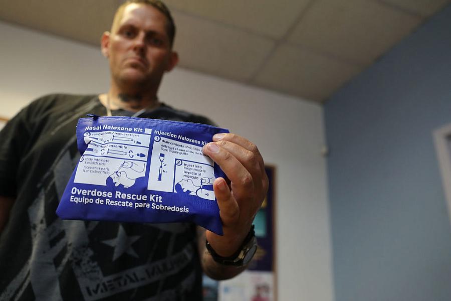
Can fresh data and visuals help readers better grapple with LA’s overdose epidemic?

Photo by Spencer Platt/Getty Images
Los Angeles County is mired in an overdose crisis that worsens by the year. Yet there is little public information on where these deaths are taking place and who is dying. Nor is there up to date data on where people can access services.
This is a problem for members of the public trying to understand the scope of the crisis, for people battling addiction and seeking help, and for policymakers looking to direct resources to high-need areas and populations.
It was also a problem I encountered when investigating fentanyl addiction in MacArthur Park as a 2023 Health Equity Fellow with the USC Center for Health Journalism. The most recent available overdose data was from 2021 and there was no ZIP code-specific death data. I also found it puzzling that MacArthur Park has a huge concentration of overdoses but few substance-use resources available.
For my 2023 Data Fellowship project, I’ll seek to gain a better understanding of the specifics of LA’s overdose crisis: who is dying, when, where and why. I also want to understand what help is being offered, where and to whom.
Then I want to compare the two sets of information to see whether our resources are being deployed in line with community needs or whether significant changes are needed to ensure help can be accessed where it is needed the most.
My hope is this reporting will serve as a resource for an everyday Angelenos navigating the challenges of our opioid crisis and seeking care for themselves or for loved ones. I also hope it will draw the attention of policymakers in charge of deploying resources and better inform their efforts to tackle the epidemic.
While my project will be primarily data driven, I’ll seek to help readers see the deaths as people, not numbers, by sharing personal stories of some of the people who died. I hope to connect with their friends and family members to learn more about who the person was before their overdose, the circumstances around the death, and learn what people who are personally impacted by the overdose crisis would like to see the city and county do to address it.
I also want to get creative about how I can use visuals to engage my audience and bring the numbers and statistics to life. The goal is to really drive home the human impact of this crisis and make people think about it in a different way than if they were to simply read the statistics in a print article.
To that end, I’d like the final project to incorporate interactive and multimedia elements. I’m interested in mapping out deaths and resources and adding filters so viewers can look at trends among race, gender, etc. For any overdose hotspots I identify, I’d like to also include photos and quotes of people living in the area to give readers a sense of what conditions are like on the ground.
I’m definitely diving into the deep end when it comes to working with data visualizations and swimming way out of my comfort zone when it comes to creating an online multimedia package. But I’m excited to roll up my sleeves and get to work.
