How we reported our investigation into stark disparities in trauma care within the U.S. health care system
The story was originally published by the The Dallas Morning News with support from our 2022 National Fellowship.


Parker County Hospital District EMS paramedic Kraig Hayman responds to a call in 2022 in Weatherford. Only three suburban EMS agencies carry blood products on ambulances, and Parker County is one of them.
Smiley N. Pool / Staff Photographer
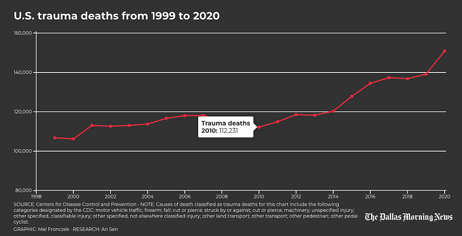
Tens of thousands of Americans bleed to death every year with injuries they could have survived, researchers say. Traumatic injuries from car crashes, shootings, stabbings, falls and other accidents are the leading killer of children and adults under age 45, and bleeding out is the leading cause of preventable trauma deaths.
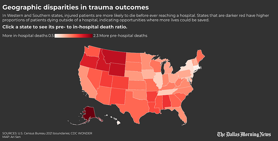
As part of our reporting on these deaths, The Dallas Morning News examined how geographic disparities impacted outcomes. We hypothesized that patients who are farther from Level I or II trauma centers — which are equipped to treat the most critically injured patients — would have a greater chance of dying before reaching a hospital because of longer transport times.
Our analysis was informed by academic articles that examined preventable trauma deaths and access to trauma care. We tested our theory at the state, county and U.S. census block level, with input from University of Alabama at Birmingham assistant professor and trauma surgeon Dr. Zain Hashmi and his research assistant, medical student Mckinley Williams. We used 2021-22 data from the American Trauma Society, Centers for Disease Control and Prevention and Census Bureau to conduct our analysis. The American Trauma Society, which tracks the location and level of care provided at trauma centers across the country, shared the data with The News under a licensing agreement.
Data analysis was conducted by News computational journalist Ari Sen. The project was supported by a National Fellowship grant from the University of Southern California’s Center for Health Journalism.
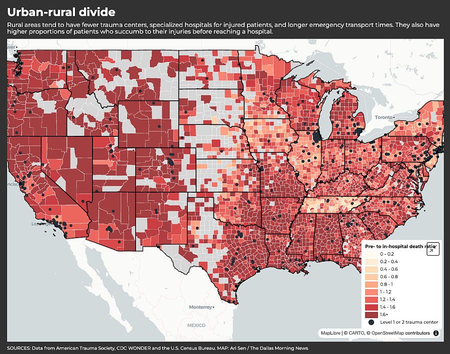
The findings echo the work of researchers who have linked rural areas with higher mortality rates for injured patients and underscore the need for improved care for these patients.
CDC WONDER DATA
Medical experts say a higher ratio of prehospital to in-hospital trauma deaths indicates there may be greater opportunities to save more injury victims, including before they bleed to death. The News’ analysis used a 2018 peer-reviewed medical journal article titled “Access Delayed is Access Denied: Relationship Between Access to Trauma Center Care and Pre-Hospital Death.” The research team was led by Hashmi, then a research fellow at Brigham and Women’s Hospital. The paper also included researchers from Harvard, Sinai Hospital in Baltimore, Oregon Health and Science University and Howard University Hospital. The researchers found states with less access to high-level trauma care had a greater ratio of prehospital to in-hospital deaths.
To perform our analysis, we relied primarily on the CDC’s Wide-ranging Online Data for Epidemiologic Research, or WONDER, a public database of mortality statistics drawn from death certificates.
Applying the methodology outlined in the paper, a trauma death was classified as prehospital if the person died at home, if the place was unknown or was marked as “other” in the data. A trauma death was classified as in-hospital if it happened at an inpatient or outpatient medical facility or emergency room or was listed as occurring in a medical facility with an unknown status. We excluded patients who were dead on arrival, following the methodology in the research paper.
We classified a death as trauma-related if it was caused by one of the following injuries:
- Cut/pierce
- Fall
- Firearm
- Machinery
- Motor vehicle traffic
- Other pedal cyclist
- Other pedestrian
- Other land transport
- Other transport
- Struck by or against
- Other specified classifiable injury
- Other specified, not elsewhere classified injury
- Unspecified injury
Because of the CDC’s interpretation of the Health Insurance Portability and Accountability Act of 1996, any location with fewer than 10 deaths in the given category was suppressed from the data. To overcome this limitation, we downloaded multiple years’ worth of data at a time or used larger geographic areas for our analyses.
STATE-LEVEL ANALYSIS
Using WONDER, we downloaded all trauma death data from 1999 to 2020, broken out by the setting where the death occurred, at the state level.
After selecting and standardizing the relevant column names, we created a pivot table showing the location and number of deaths in each state, joined it to the original data and dropped all duplicate rows.
We then added all prehospital deaths and separately combined all in-hospital deaths to compute our ratios.
To deal with the data suppression, we estimated a minimum value of zero and maximum value of nine for the missing values, computed the minimum ratio and visualized the ratio of prehospital and in-hospital deaths on a map.
Based on these findings, trauma patients seem more likely to die before reaching the hospital in Western states, which tend to be more rural and have fewer high-level trauma centers when compared with Eastern states.
COUNTY-LEVEL ANALYSIS
To determine the ratios at the county level we again used CDC’s WONDER, this time at the county level for 1999-2020 filtered to include only trauma deaths and broken out by setting.
We performed the same initial steps as the state analysis to clean and analyze our data. But unlike in the state-level analysis, we removed all counties that had two or more prehospital or in-hospital categories missing because of the high amount of variance relative to the county size. Even after excluding these areas, we retained 2,667 of the 3,083 (roughly 86.5%) counties in the dataset.
As we did with the states, we set our minimum value at zero and our maximum value at nine for all the remaining suppressed areas and then computed the minimum ratio. These values were used to create a county-level map.
With data compiled by Mckinley Williams, we also attempted to conduct the analysis using the CDC’s National Center for Health Statistics Urban-Rural Classification Scheme, which groups counties by population. Given the difficulty explaining these categories to a general audience and the inability to visualize them effectively, we chose to focus our analysis at the county level.
TRAUMA CENTER DATA
Trauma centers are categorized according to their level of care on a scale of I to V. Level I provides the highest level of care for injured patients.
Trauma centers can be designated by either the American College of Surgeons, or ACS, the state or both. Level I trauma centers must have a certain number of surgeons, ER doctors, anesthesiologists, nurses, respiratory therapists and other personnel available 24 hours a day to maintain their designation. Level II trauma centers can treat all levels of injured patients but typically do not have the research capabilities of a Level I center.
We chose to focus on ACS or state-designated Level I and II centers, as our reporting focuses on major bleeding and they provide the best chance of survival for the most severely injured patients. We did not include hospitals that had only a pediatric Level I or II designation.
Once our data was filtered, we geocoded all of the addresses to obtain the latitude and longitude for each trauma center.
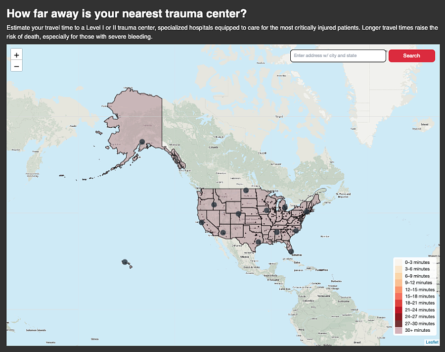
THE DISTANCE MAP
We built the map to give readers a clear sense of the geographic disparities in trauma care access between urban centers and rural areas, and to allow readers to test addresses, including their own, to see how far they are from a Level I or II center.
To gauge the distance to each trauma center, we converted our geocoded trauma center data into a spatial file. We changed the coordinate reference system (ie. the framework used to locate points on the Earth’s surface) to compute the distance in meters and subsequently transformed it into miles.
We obtained the shapefiles for every 2022 census block and combined them. We used blocks because they are the smallest unit of measurement the Census Bureau offers that provides the most accurate distance calculation for the map without geocoding every address in the United States. As with the trauma centers, we converted the block file’s coordinate reference system to compute the distance to our trauma centers in miles. We used Geopandas sjoin_nearest function and the centermost point for each block to calculate the approximate distance to the nearest trauma center.
Following a tutorial from Texas Christian University professor Kyle Walker, we used the routingpy library and Mapbox’s API to generate drive times to a hospital, called isochrones. We drew the isochrones in 3-minute increments and removed the next smallest area from the center (as if creating a doughnut), until we reached 30 minutes, to avoid overlapping segments. We chose to stop there because studies have indicated trauma mortality increases every minute, especially around the 30-minute mark.
We developed an algorithm with help from GIS Stack Exchange user BERA to find areas close to multiple trauma centers, because some locations are close to multiple hospitals. It starts by extracting the boundaries; combines them into a multiline shape by merging the overlapping segments; builds new shapes; and associates them with the corresponding information from the original polygons.
For areas beyond 30 minutes, we estimate travel time using the distance from the center of census blocks to the nearest trauma center with an average speed of 45 mph.
Our map gives readers an understanding of their proximity to high-level trauma care. It also accounts for geographic features common in states like Colorado that impact accessibility, such as rough terrain, lack of paved roads or bodies of water. The map also shows how well dense metropolitan areas like Dallas-Fort Worth are served by Level I and II trauma centers.
CONCLUSION
Our interviews and the medical literature suggested distance and time to high-quality trauma care play a major role in outcomes after a major injury.
Our map allows readers to see these disparities, including the country’s expansive trauma care deserts, and shows how they apply to their own communities.